Access the Heat Map workspace
To view data for performance analysis of a single employee or organization, access the Heat Map workspace Area within an application window where the user interacts with the program..

Procedure
-
Select a Time period and multiple Employees or Organizations in the left selection pane.
-
Select multiple KPIs in the left pane of Performance widget Visual building block in an application that is interchangeable, depending on system or user configurations..
The Heat Map can display up to 2500 cells of performance data. If you reach the limit of the number of cells that can be displayed, you can:
-
Reduce the number of employees displayed using the employee filter, or by selecting fewer employees.
-
Reduce the number of KPIs displayed using the KPI filter.
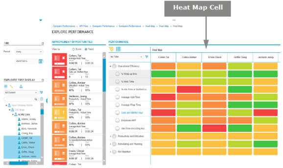
The color of each Heat Map cell is based on the employee score for the KPI or objective.
|
Score Color |
Description |
|---|---|
|
Dark Green
|
Excellent: Score exceeded the goal by the variance level or more. |
|
Light Green
|
Good: Score met the goal at the planned goal or within the variance level toward the direction of the variance. |
|
Light Orange
|
Average: Score is within the variance level, but away from the direction of the variance. |
|
Dark Orange
|
Poor: Score missed the goal by more than the allowed variance level. |
|
Red
|
Out of Range: Score is outside the value range. |
|
Gray
|
No score or user does not have privilege Permissions associated with each role that define the features of the application a user is able to view and the functionality in the application the user can access. to view score. |


